
Plotting
Contents
4.6. Plotting#
4.6.1. Visualization#
One of the most important outputs of your analysis will be the visualizations that you choose to communicate what you’ve discovered.
Here are what some people – whom we think have earned the right to an opinion on this material – have said with respect to data visualizations.
Above all else, show the data – Edward Tufte
By visualizing information, we turn it into a landscape that you can explore with your eyes. A sort of information map. And when you’re lost in information, an information map is kind of useful – David McCandless
I spend hours thinking about how to get the story across in my visualizations. I don’t mind taking that long because it’s that five minutes of presenting it or someone getting it that can make or break a deal – Goldman Sachs executive
We won’t have time to cover “how to make a compelling data visualization” in this lecture.
Instead, we will focus on the basics of creating visualizations in Python.
This will be a fast introduction, but this material appears in almost every lecture going forward, which will help the concepts sink in.
In almost any profession that you pursue, much of what you do involves communicating ideas to others.
Data visualization can help you communicate these ideas effectively, and we encourage you to learn more about what makes a useful visualization.
We include some references that we have found useful below.
4.6.2. matplotlib#
The most widely used plotting package in Python is matplotlib.
The standard import alias is
import matplotlib.pyplot as plt
import numpy as np
Note above that we are using matplotlib.pyplot rather than just matplotlib.
pyplot is a sub-module found in some large packages to further organize functions and types. We are able to give the plt alias to this sub-module.
Additionally, when we are working in the notebook, we need tell matplotlib to display our images inside of the notebook itself instead of creating new windows with the image.
This is done by
%matplotlib inline
The commands with % before them are called Magics.
4.6.2.1. First Plot#
Let’s create our first plot!
After creating it, we will walk through the steps one-by-one to understand what they do.
# Step 1
fig, ax = plt.subplots()

# Step 2
x = np.linspace(0, 2*np.pi, 100)
y = np.sin(x)

# Step 3
ax.plot(x, y)
[<matplotlib.lines.Line2D at 0x2abaddbd5b0>]
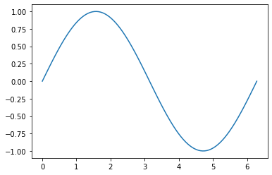
Create a figure and axis object which stores the information from our graph.
Generate data that we will plot.
Use the
xandydata, and make a line plot on our axis,ax, by calling theplotmethod.
4.6.2.2. Two ways of making a plot#
Matplotlib is unusual in that it offers two different interfaces to plotting.
One is a simple API (Application Programming Interface).
The other is a more “Pythonic” object-oriented API.
For reasons described below, we recommend that you use the second API.
But first, let’s discuss the difference.
4.6.3. The APIs#
4.6.3.1. The simple API#
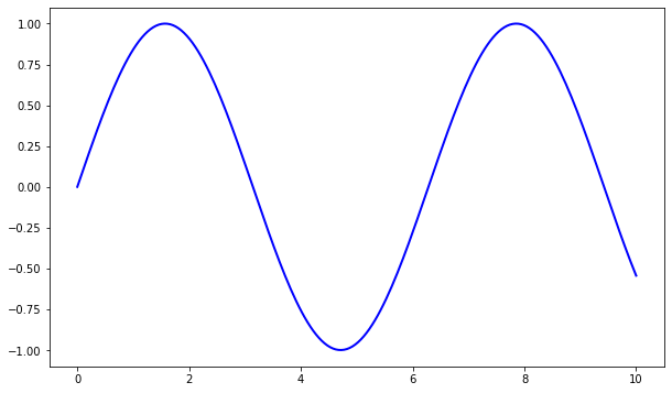
Here’s the kind of easy example you might find in introductory treatments
%matplotlib inline
import matplotlib.pyplot as plt
plt.rcParams["figure.figsize"] = (10, 6) #set default figure size
import numpy as np

x = np.linspace(0, 10, 200)
y = np.sin(x)

plt.plot(x, y, 'b-', linewidth=2)
[<matplotlib.lines.Line2D at 0x2abade32430>]

This is simple and convenient, but also somewhat limited and un-Pythonic.
For example, in the function calls, a lot of objects get created and passed around without making themselves known to the programmer.
This leads us to the alternative, object-oriented Matplotlib API.
4.6.3.2. The Object-Oriented API#
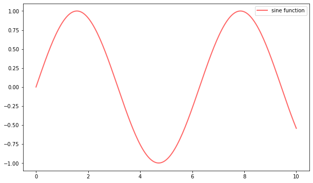
Here’s the code corresponding to the preceding figure using the object-oriented API
fig, ax = plt.subplots()
ax.plot(x, y, 'b-', linewidth=2)
[<matplotlib.lines.Line2D at 0x2abadfc9b80>]
Here the call fig, ax = plt.subplots() returns a pair, where
figis aFigureinstance—like a blank canvas.axis anAxesSubplotinstance—think of a frame for plotting in.
The plot() function is actually a method of ax.
While there’s a bit more typing, the more explicit use of objects gives us better control.
This will become more clear as we go along.
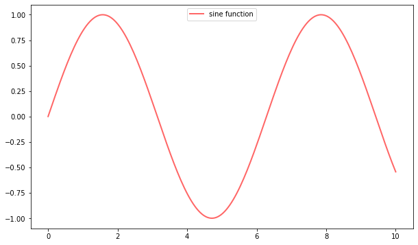
4.6.3.3. Tweaks#
Here we’ve changed the line to red and added a legend
fig, ax = plt.subplots()
ax.plot(x, y, 'r-', linewidth=2, label='sine function', alpha=0.6)
ax.legend()
<matplotlib.legend.Legend at 0x2abadebe550>
We’ve also used alpha to make the line slightly transparent—which makes it look smoother.
The location of the legend can be changed by replacing ax.legend() with ax.legend(loc='upper center').
fig, ax = plt.subplots()
ax.plot(x, y, 'r-', linewidth=2, label='sine function', alpha=0.6)
ax.legend(loc='upper center')
<matplotlib.legend.Legend at 0x2abadf36e80>
Controlling the ticks, adding titles and so on is also straightforward
fig, ax = plt.subplots()
ax.plot(x, y, 'r-', linewidth=2, label='y=sin(x)', alpha=0.6)
ax.legend(loc='upper center')
ax.set_yticks([-1, 0, 1])
ax.set_title('Test plot')
plt.show()
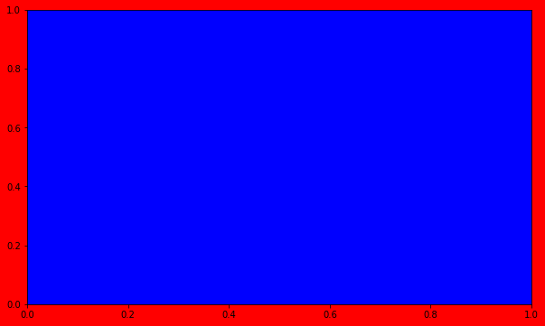
4.6.4. Difference between Figure and Axis#
We’ve found that the easiest way for us to distinguish between the figure and axis objects is to think about them as a framed painting.
The axis is the canvas; it is where we “draw” our plots.
The figure is the entire framed painting (which inclues the axis itself!).
We can also see this by setting certain elements of the figure to different colors.
fig, ax = plt.subplots()

fig.set_facecolor("red")
ax.set_facecolor("blue")
4.6.5. More Features#
Matplotlib has a huge array of functions and features, which you can discover over time as you have need for them.
We mention just a few.
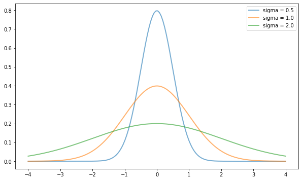
4.6.5.1. Multiple Plots on One Axis#
It’s straightforward to generate multiple plots on the same axes.
Here’s an example that randomly generates three normal densities and adds a label with their standard deviation
from scipy.stats import norm
from random import uniform

fig, ax = plt.subplots()
x = np.linspace(-4, 4, 150)
S=[0.5,1.,2.]

for i in range(3):
    m, s = 0., S[i]
    y = norm.pdf(x, loc=m, scale=s)
    current_label = f'sigma = {s:.2}'
    ax.plot(x, y, linewidth=2, alpha=0.6, label=current_label)
ax.legend()
<matplotlib.legend.Legend at 0x2abcdda8fd0>
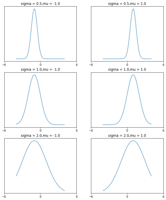
4.6.5.2. Multiple Subplots#
Sometimes we want multiple subplots in one figure.
Here’s an example that generates 6 histograms for 6 different draws of the standard normal distribution
num_rows, num_cols = 3, 2
fig, axes = plt.subplots(num_rows, num_cols, figsize=(10, 12))
m, s = 0., 1.

S=[0.5,1.,2.]
E=[-1.,1.]
for i in range(len(S)):
    for j in range(len(E)):
        m, s = E[j], S[i]
        y = norm.pdf(x, loc=m, scale=s)
        current_label = f'sigma = {s:.2},mu = {m:.2}'
        axes[i, j].plot(x, y, linewidth=2, alpha=0.6, label=current_label)
        t = f'mu = {m:.2}, sigma = {s:.2}'
        axes[i, j].set(title=current_label, xticks=[-6, 0, 6], yticks=[])
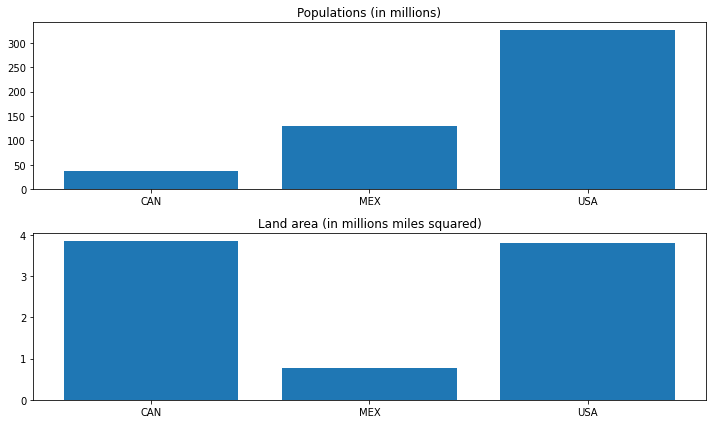
4.6.5.3. Bar#
countries = ["CAN", "MEX", "USA"]
populations = [36.7, 129.2, 325.700]
land_area = [3.850, 0.761, 3.790]

fig, ax = plt.subplots(2)

ax[0].bar(countries, populations, align="center")
ax[0].set_title("Populations (in millions)")

ax[1].bar(countries, land_area, align="center")
ax[1].set_title("Land area (in millions miles squared)")

fig.tight_layout()
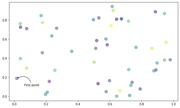
4.6.5.4. Scatter and annotation#
N = 50
# randomize data for location and coloes
x = np.random.rand(N)
y = np.random.rand(N)
colors = np.random.rand(N)

fig, ax = plt.subplots()

ax.scatter(x, y, s=100, c=colors, alpha=0.5)

# draw an annotation
ax.annotate(
    "First point", xy=(x[0], y[0]), xycoords="data",
    xytext=(25, -25), textcoords="offset points",
    arrowprops=dict(arrowstyle="->", connectionstyle="arc3,rad=0.6")
)
Text(25, -25, 'First point')
The custom subplots function
calls the standard
plt.subplotsfunction internally to generate thefig, axpair,makes the desired customizations to
ax, andpasses the
fig, axpair back to the calling code.
4.6.6. Further Reading#
The Matplotlib gallery provides many examples.
A nice Matplotlib tutorial by Nicolas Rougier, Mike Muller and Gael Varoquaux.
Seaborn facilitates common statistics plots in Matplotlib.